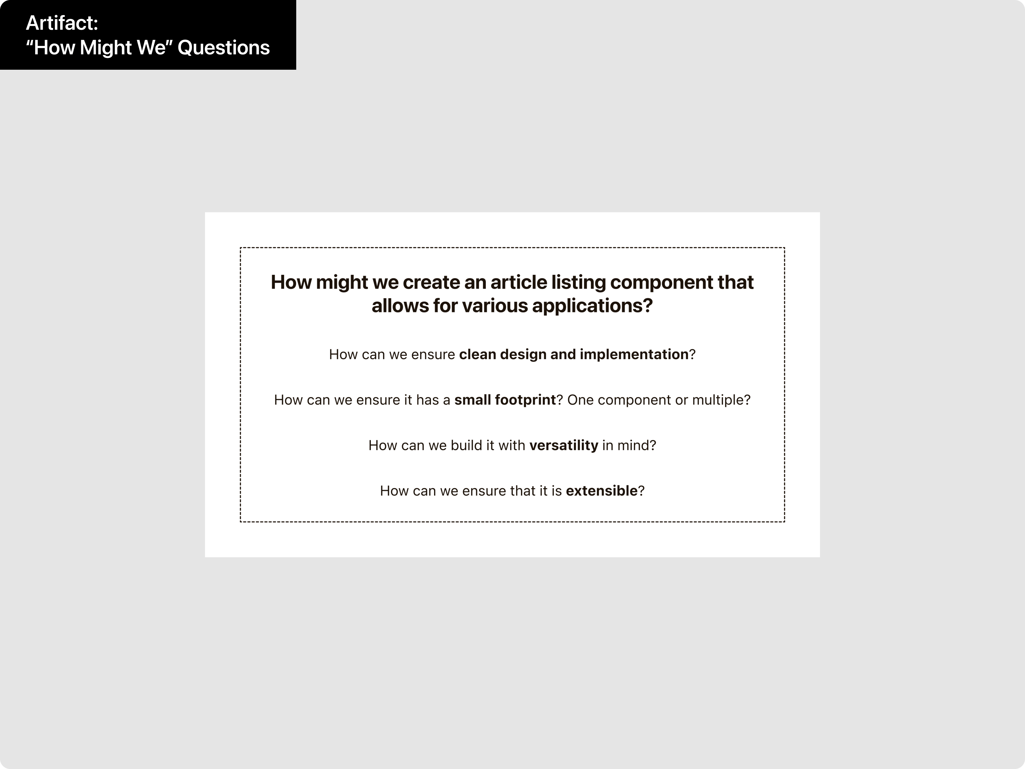
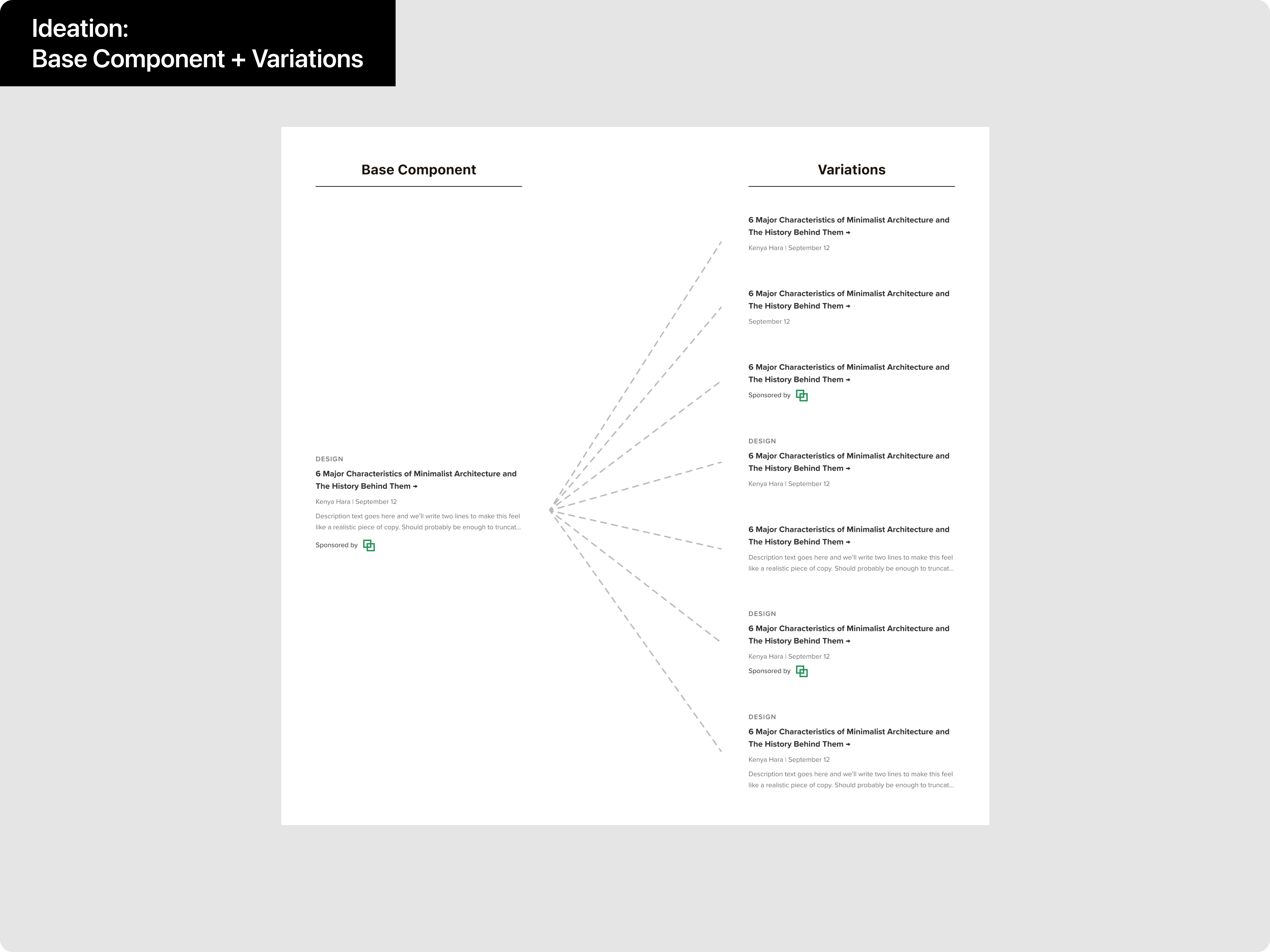
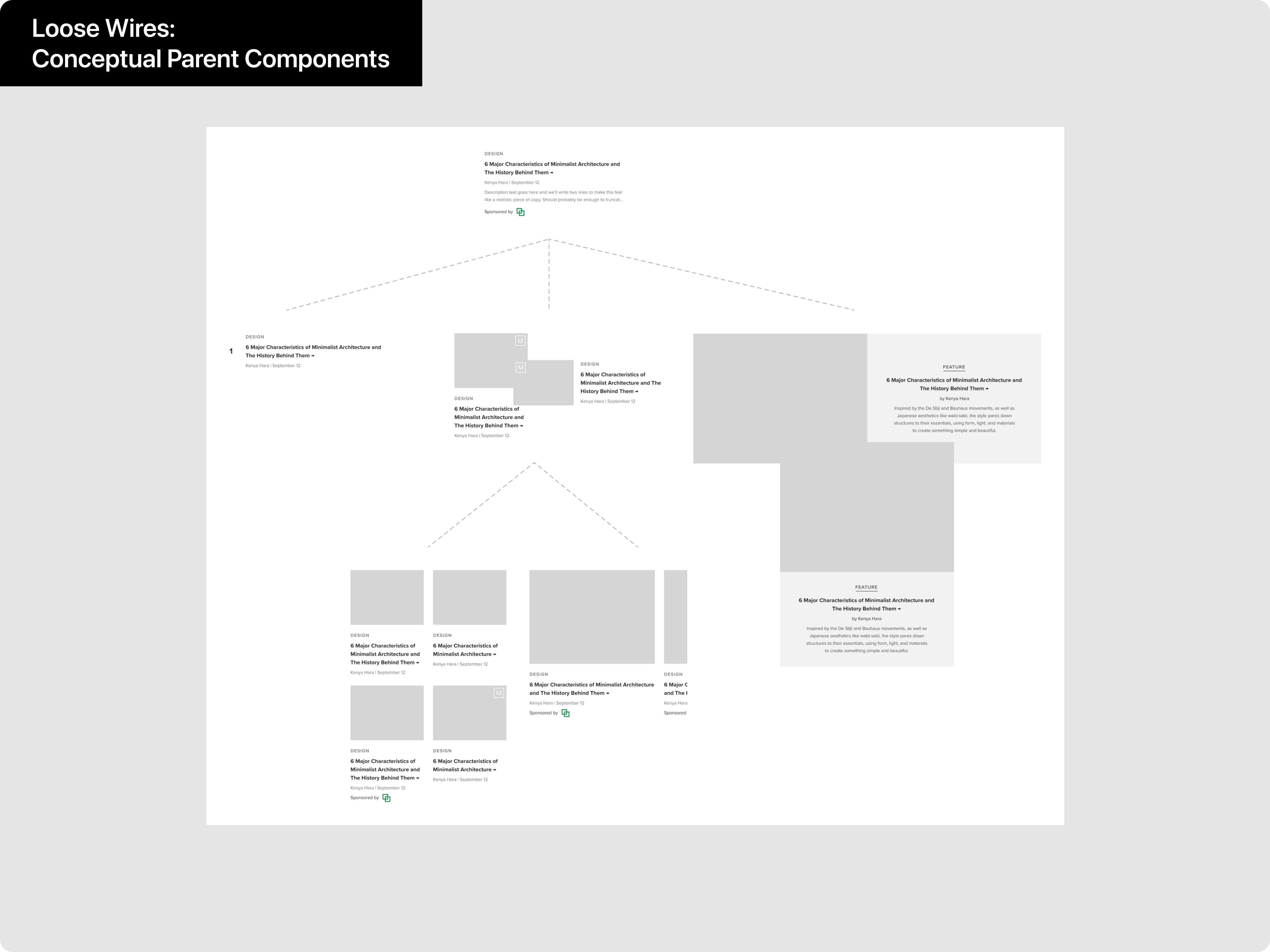
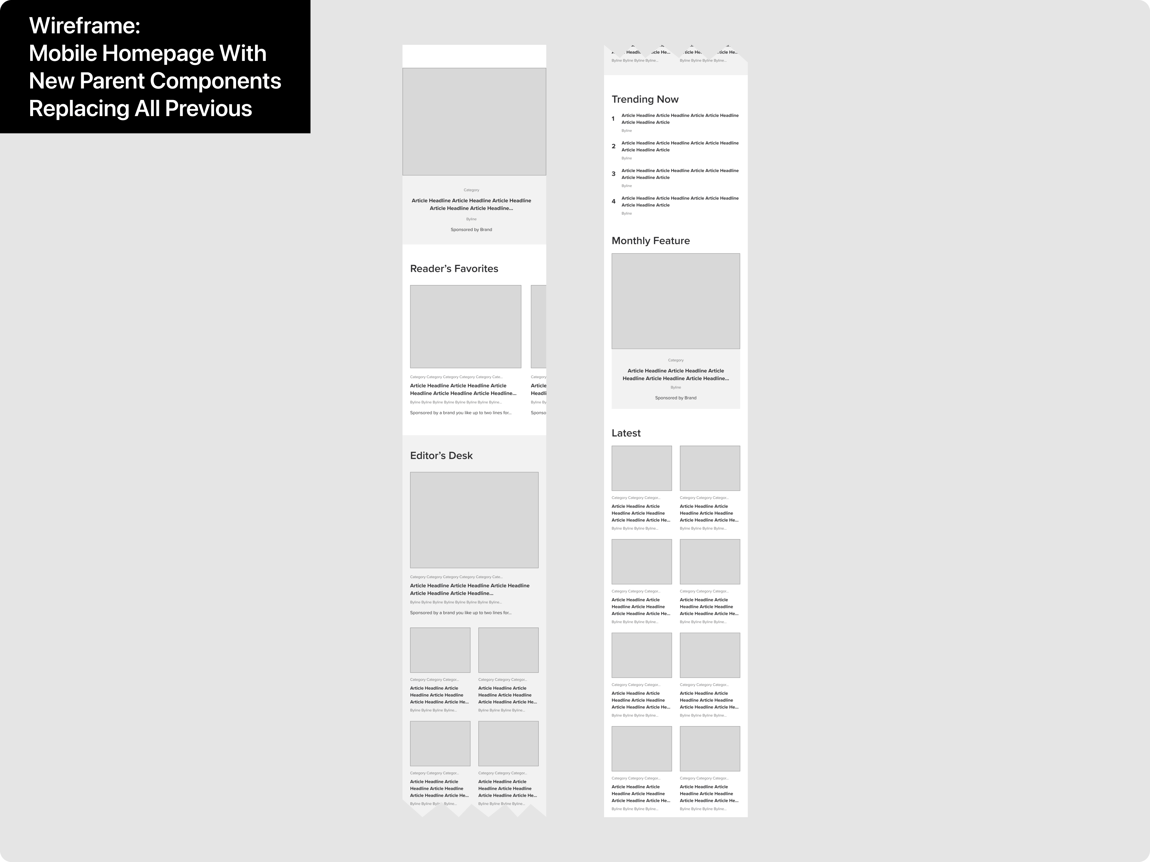
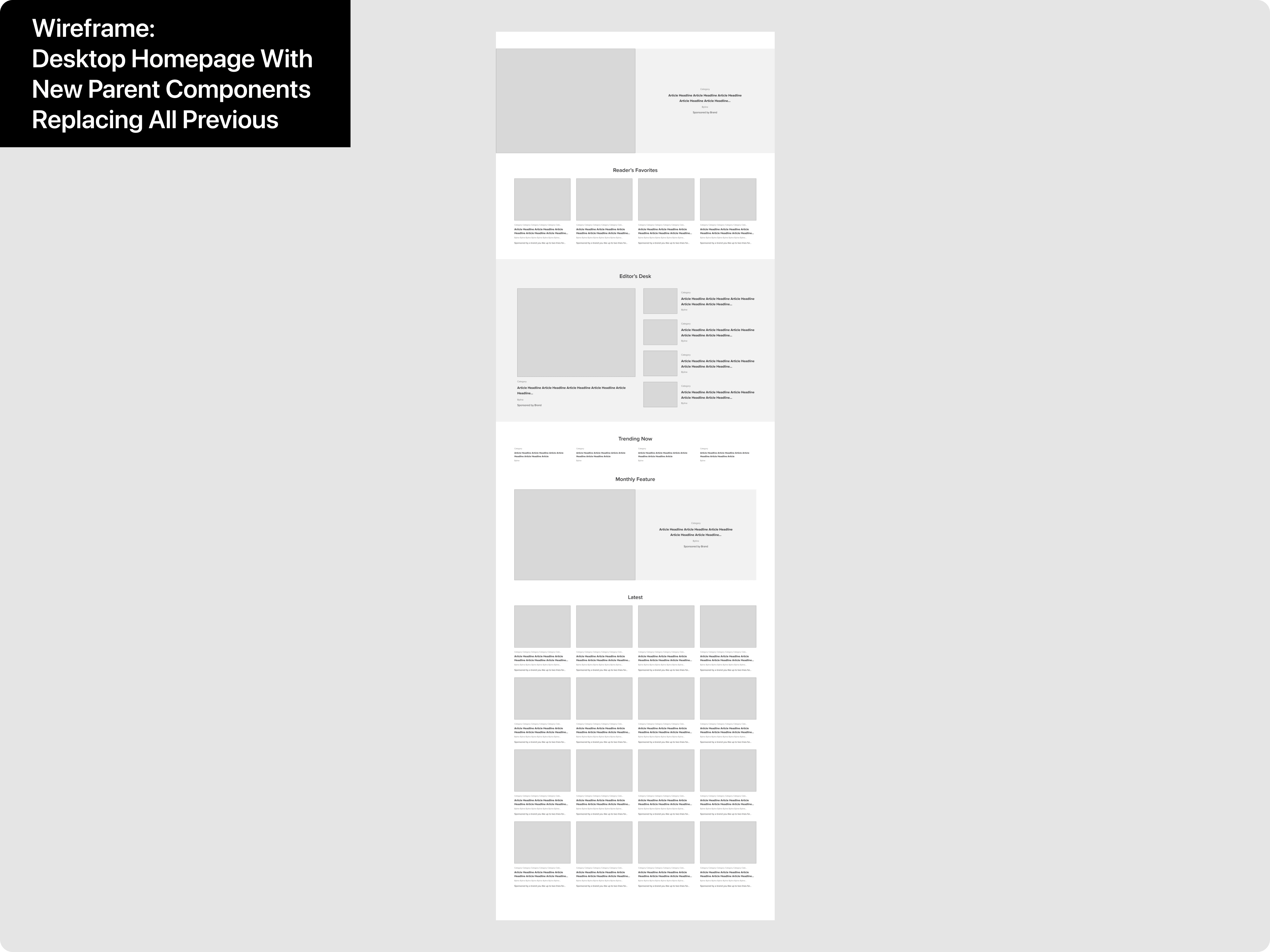
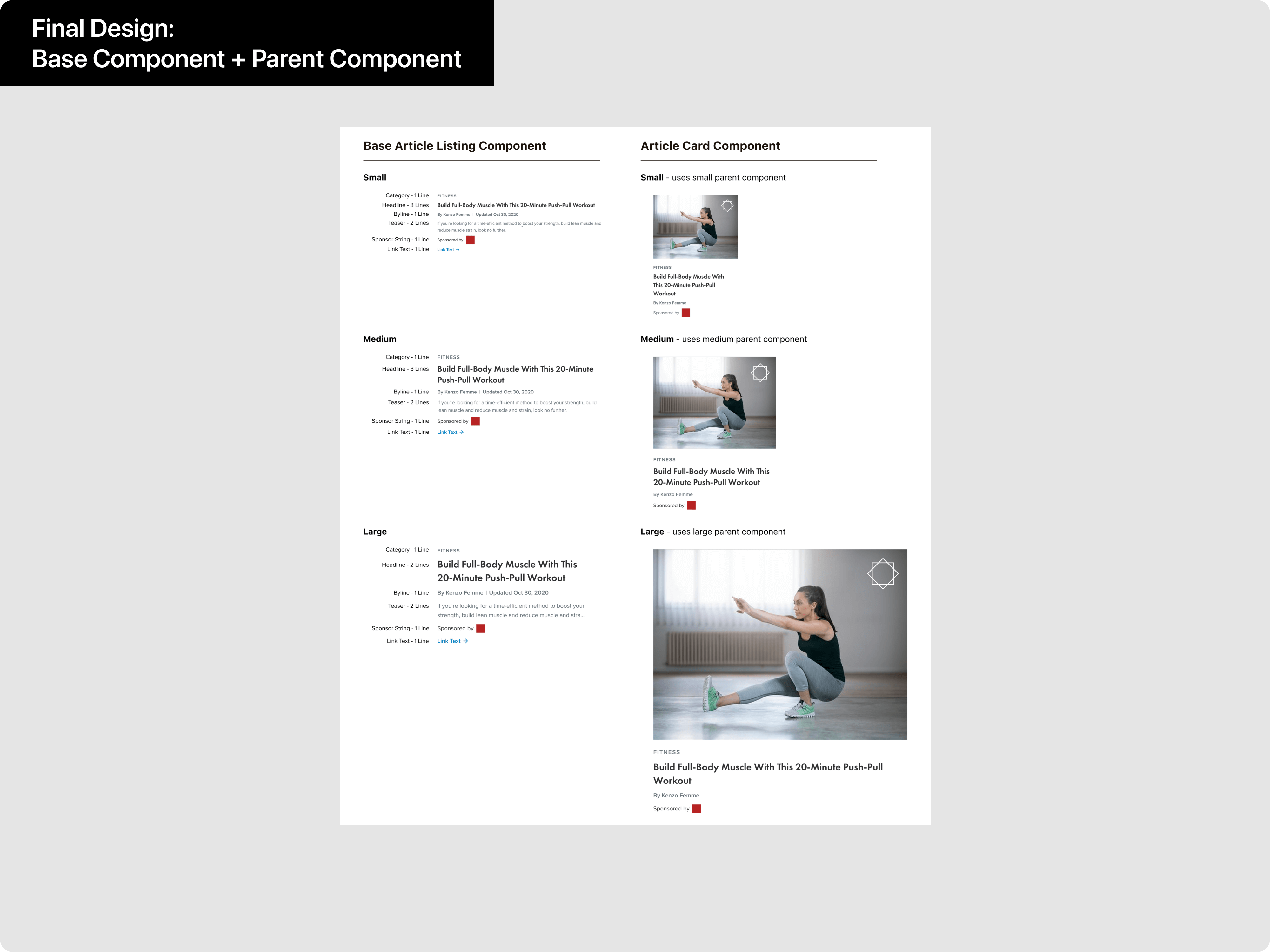
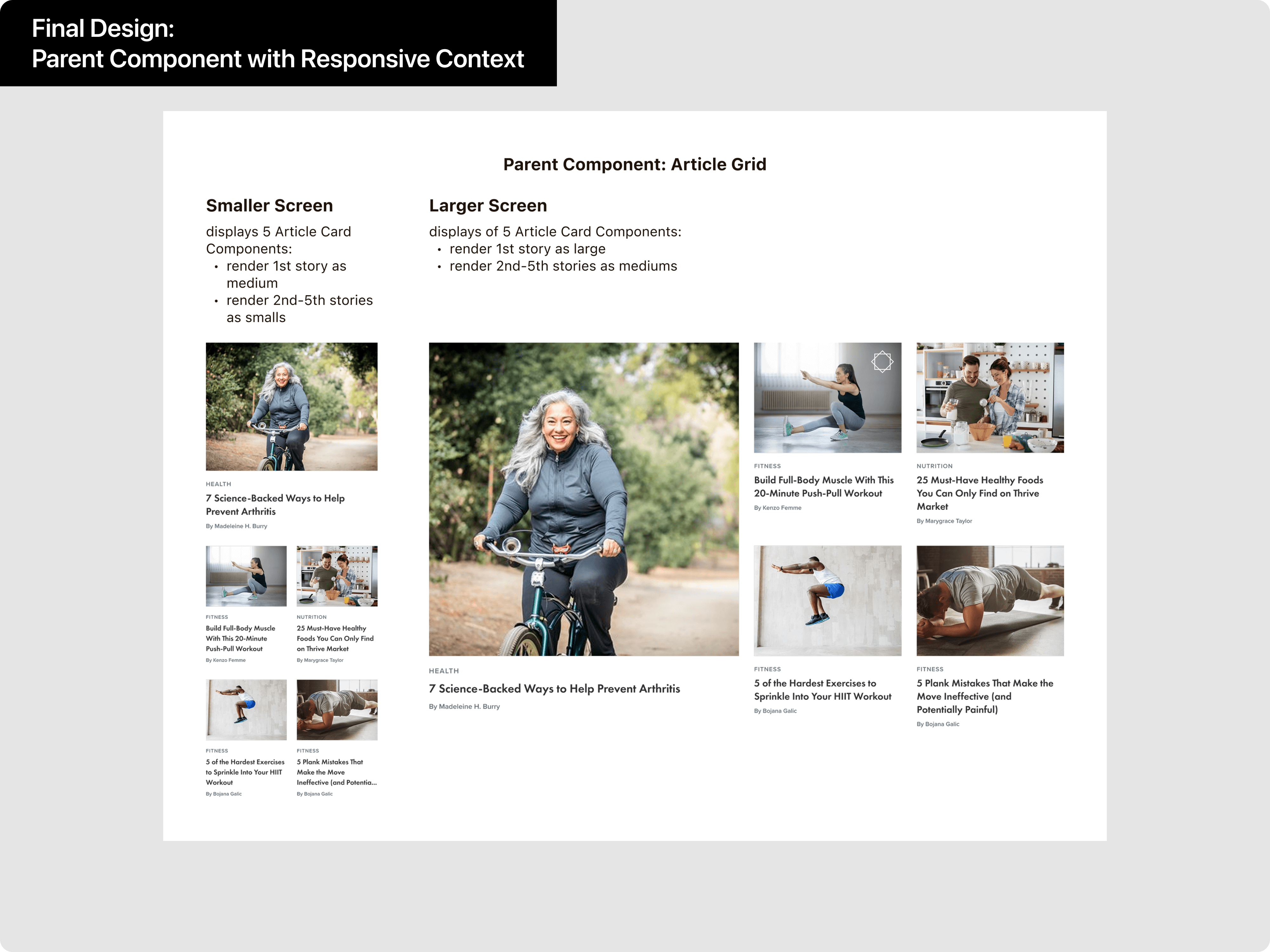
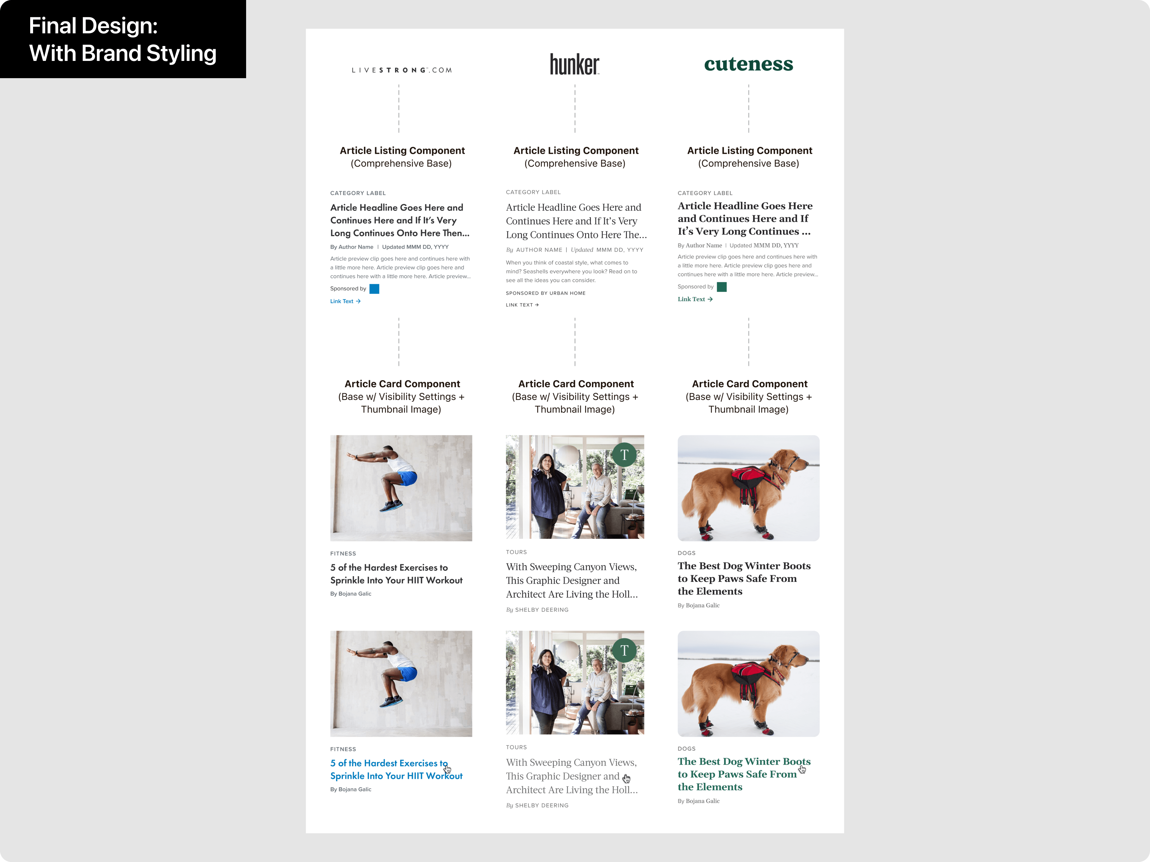
Leaf Group owns and operates numerous media brands each with their own site design and implementation. As part of this project, the different variations of article cards within each site and across Leaf Group's numerous web properties become standardized under a new centralized and customizable component implementation.
Benefit for the User
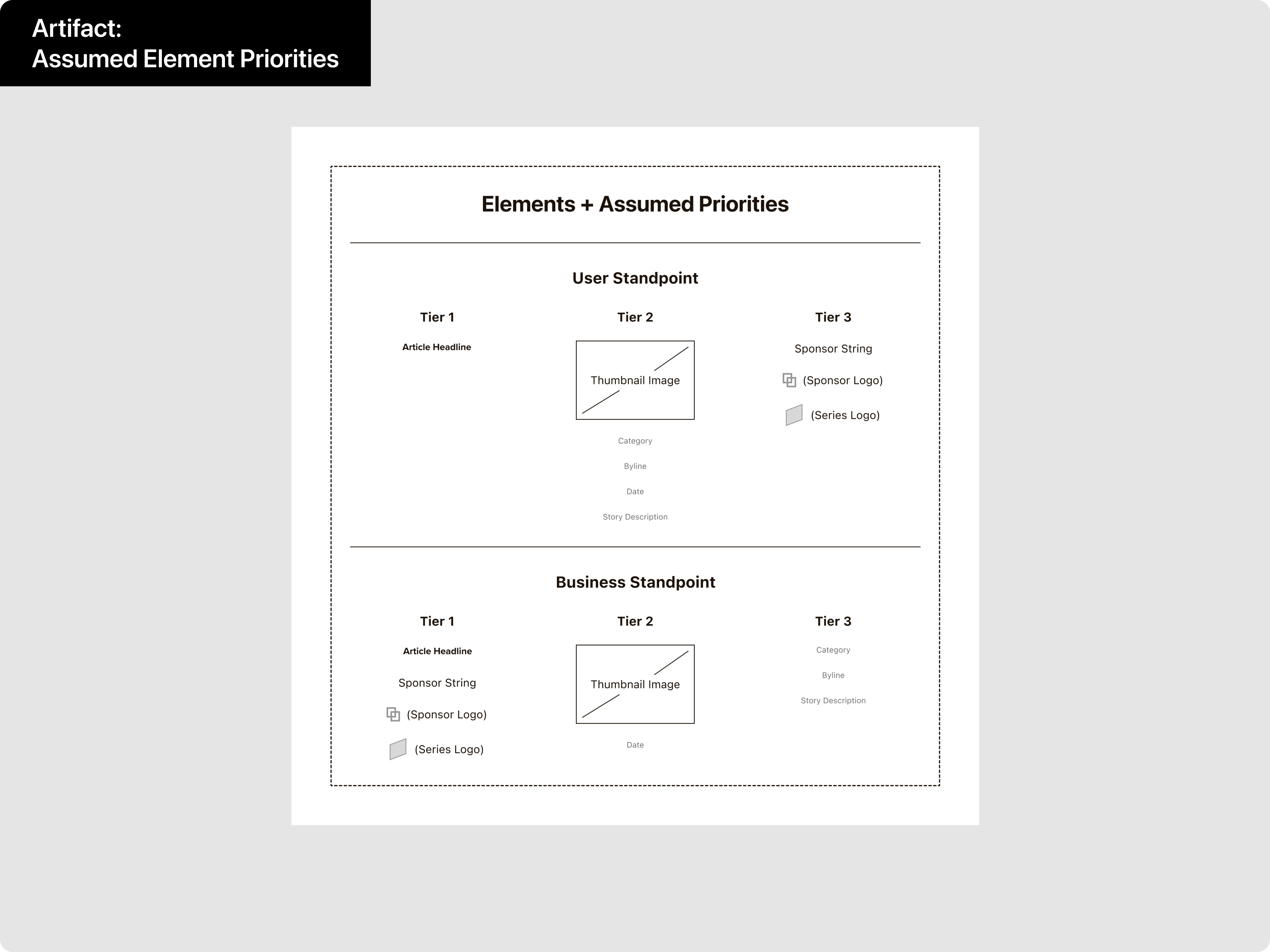
- The design, layout, and styling of article cards within any given Leaf Group site becomes standardized allowing for a better user experience.
Benefits for the Product
- The product gains several variants of the new article card component to properly replace all outgoing article card instances.
- The product gains visual consistency aiding efforts to be perceived as a professional and trustworthy source for information.
Benefits for the Team
- The new implementation facilitates future multi-brand product initiatives involving article cards.
- Cross-selling efforts by Sales Team are facilitated at both an individual site level and across Leaf Group's properties.
No items found.